
Case study 03 · UX Research / Human-Centred Design / Service Design
Designing safety information across the whole journey.
How could passengers get information relevant to safety, so they can make more informed travel decisions? Our team explored this for Gothenburg’s public transport, and designed a safety score that follows the passenger from the app to the stop and onto the vehicle.
- Project
- Public Transport & the Perception of Safety
- Team
- Six designers, Chalmers University of Technology & University of Gothenburg
- My part
- Observations, personas, focus groups and the prototype
- Location
- Gothenburg, Sweden · Västtrafik
01Context
Perceived risk shaped travel as much as actual risk.
Ridership in Västra Götaland fell by around 40% during the pandemic, yet the research we reviewed did not show a strong link between riding public transport and transmission rates. The gap between perceived and actual risk became the design problem.
The perception problem / 01
People felt unsafe without knowing what was actually on board.
Studies showed that willingness to use public transport relied heavily on perceived comfort and safety. Passengers had little information about crowding or conditions before they boarded, which left them with a sense of uncertainty and little control.
Research question / 02
How can public transport users get information relevant to safety?
The aim was to improve their riding experience in a pandemic, focusing on Gothenburg and the Västtrafik ecosystem, with passengers, drivers and Västtrafik as stakeholders.
02Research
Understand how people actually travel and what makes them feel safe.
We followed a human-centred design process based on ISO 9241: understanding the context of use, specifying requirements, producing design solutions and evaluating them with users.
Understand / 01
Literature review
Ten publications analysed into five themes, with a gap analysis.
Understand / 02
Questionnaire
Travel habits and sense of safety, analysed thematically.
Understand / 03
Field observations
Domkyrkan, Hjalmar Brantingsplatsen and Vågmästareplatsen.
Specify / 04
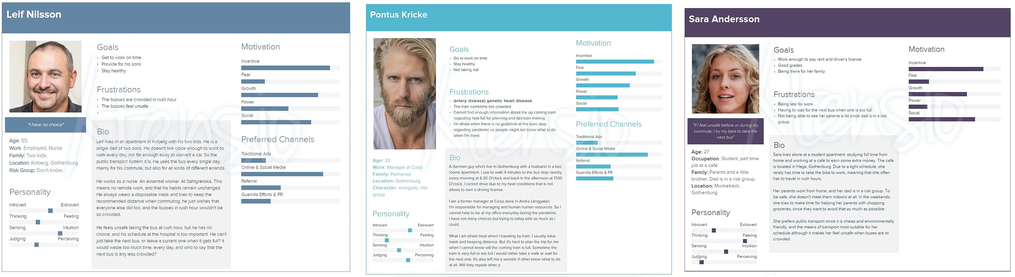
Personas & To Go review
Three personas and an evaluation of the current Västtrafik To Go app.
Questionnaire
How safe respondents felt on public transport
- 38.9%Unsafe
- 55.6%Neither safe nor unsafe
- 5.6%Safe
- People travel less
- They avoid rush hours
- They keep their distance
- Fewer people on board feels safer
What we observed
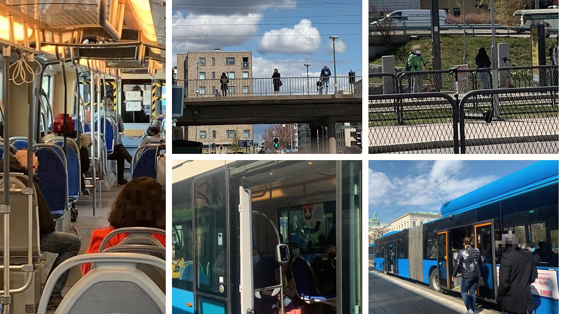
- People keep their distance when they can.
- Senior citizens isolate; younger passengers are less cautious.
- Congestion, masks and air circulation shape how safe a vehicle feels.
- Safety guidance relies on educational posters and passengers’ own engagement.
03Requirements
Prioritise what the system must say, and where.
Requirements came from the personas and were prioritised with MoSCoW, plus an extra category for what the solution should not do.
- Must have
- Show a safety score visually, on vehicles, at bus and tram stops, and in the app.
- Show information about the new safety system at stops.
- Explain what parameters the safety score depends on.
- Should have
- Convey how crowded a vehicle is, and whether people keep their distance and wear masks.
- Present information from a safety perspective, updated in real time.
- Use existing technology such as screens and the app wherever possible.
- Could have
- A visual crowd-density map.
- Tracking of sanitation levels.
- Won’t have
- Noise levels on board.
- Should not
- Reduce ridership, contradict Västtrafik’s development projects, or add unnecessary navigation.
04Ideation
Explore two ways to make risk visible.
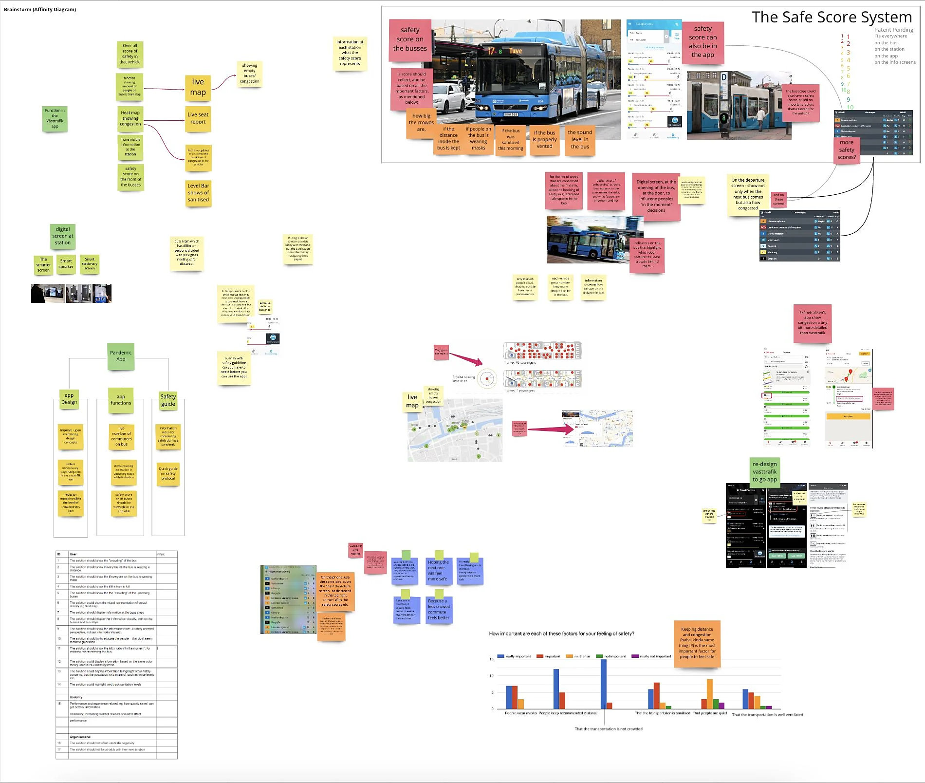
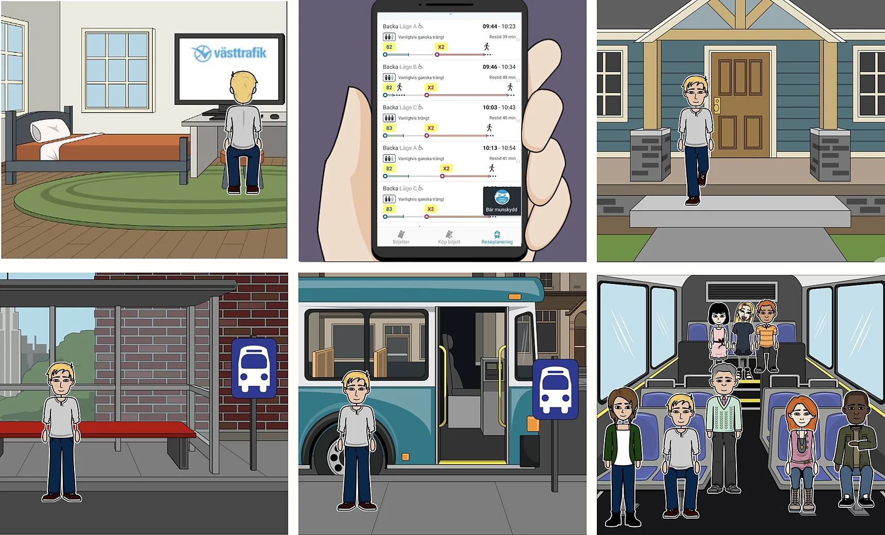
Using a participatory design framework, the team brainstormed with an affinity diagram, sketched, built a user scenario as a storyboard and selected ideas with dot voting.
Concept / 01
Score System
A rating based on four factors: crowd size, how many people wear masks, sanitation level and how many keep their distance. It is shown at stops, on vehicles and in the app, for spontaneous decisions on the move.
Concept / 02
Heat Map System
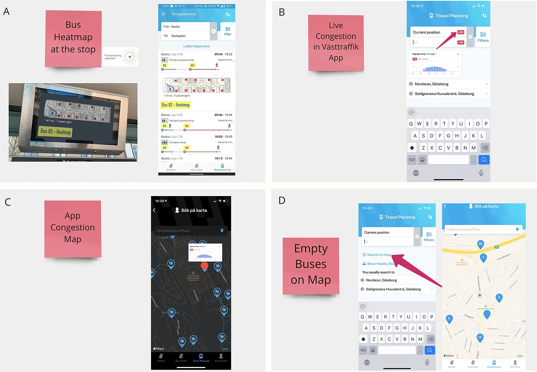
Detailed, real-time congestion at stops and inside vehicles, in the app and on Västtrafik’s website. Aimed at people who plan ahead and those at greater risk.
05Focus Groups
Let passengers choose between the concepts.
Five focus groups of 2–3 participants each. Every session moved from a scenario, to discussion of sketch prototypes, to a vote. Participants compared the two concepts and four visual elements.
Votes / Concept
- Score System7
- Heat Map System1
Votes / Visual element
- Colour dot7
- Scale bar2
- Icon1
- Number1
The Score System with coloured dots received the most votes and was refined further.
06Final Concept
One score, readable everywhere a passenger looks.
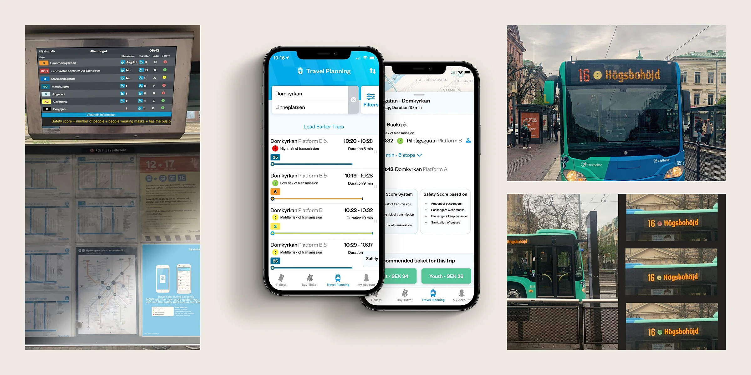
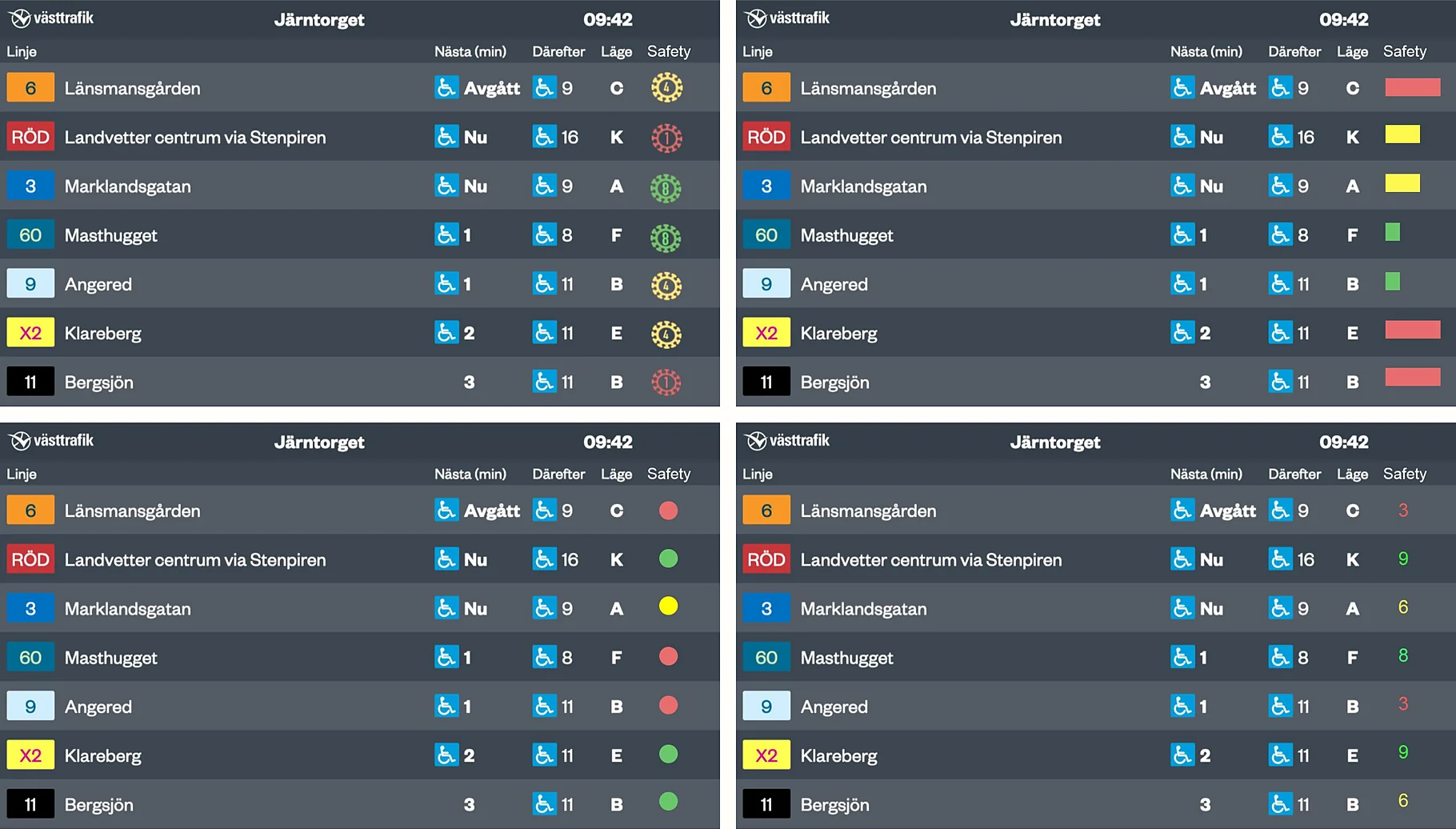
The final concept is a multifaceted service: a safety score shown as coloured dots, presented at every point in the journey where a passenger decides whether to travel.
- Low risk of transmission
- Middle risk of transmission
- High risk of transmission
- Low risk of transmission
- Middle risk of transmission
- High risk of transmission
The score is based on
- Size of the crowd
- People wearing masks
- Sanitation level
- People keeping their distance
The score is a proof of concept. The underlying calculation was left for future work.
Touchpoint / 01
At the stop
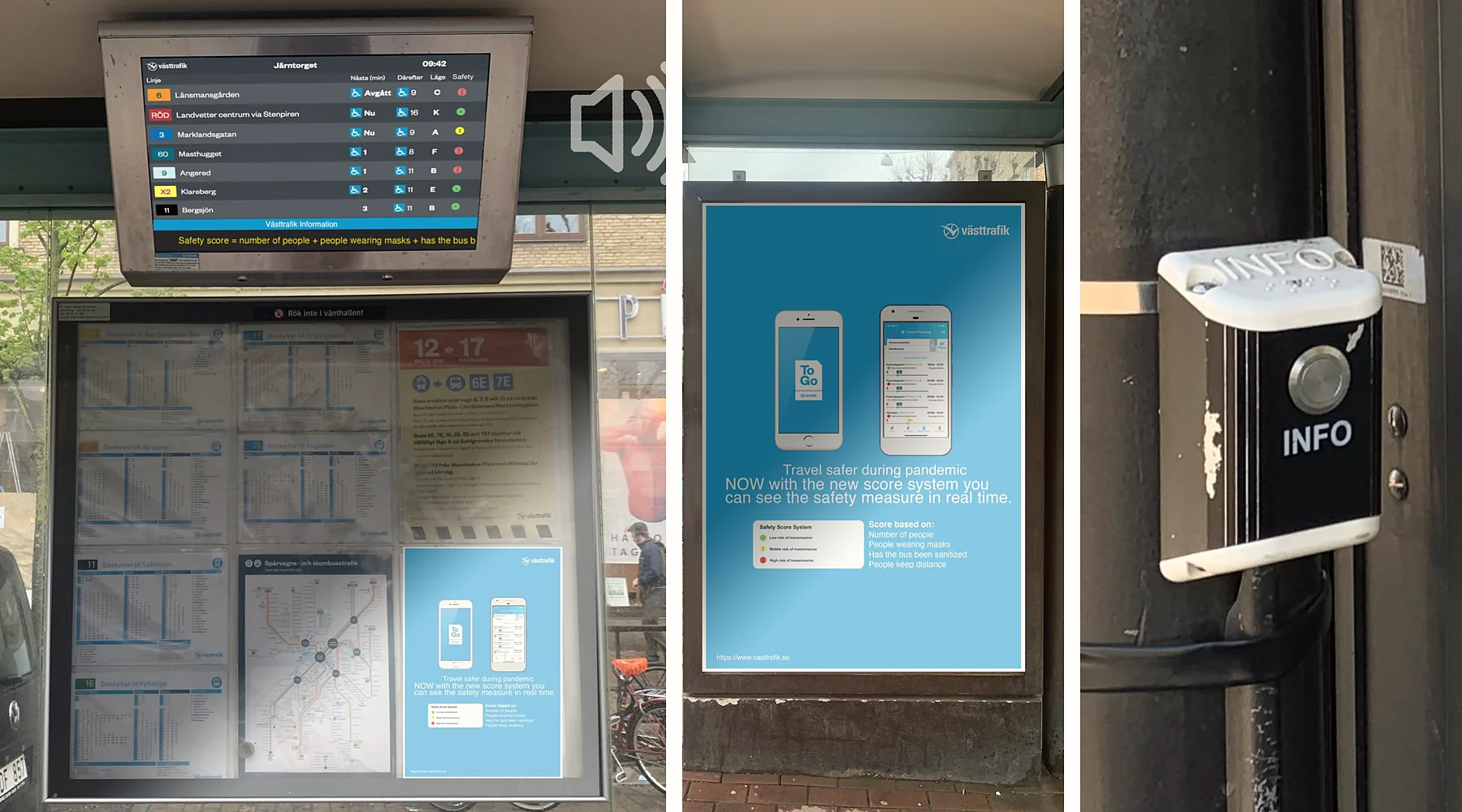
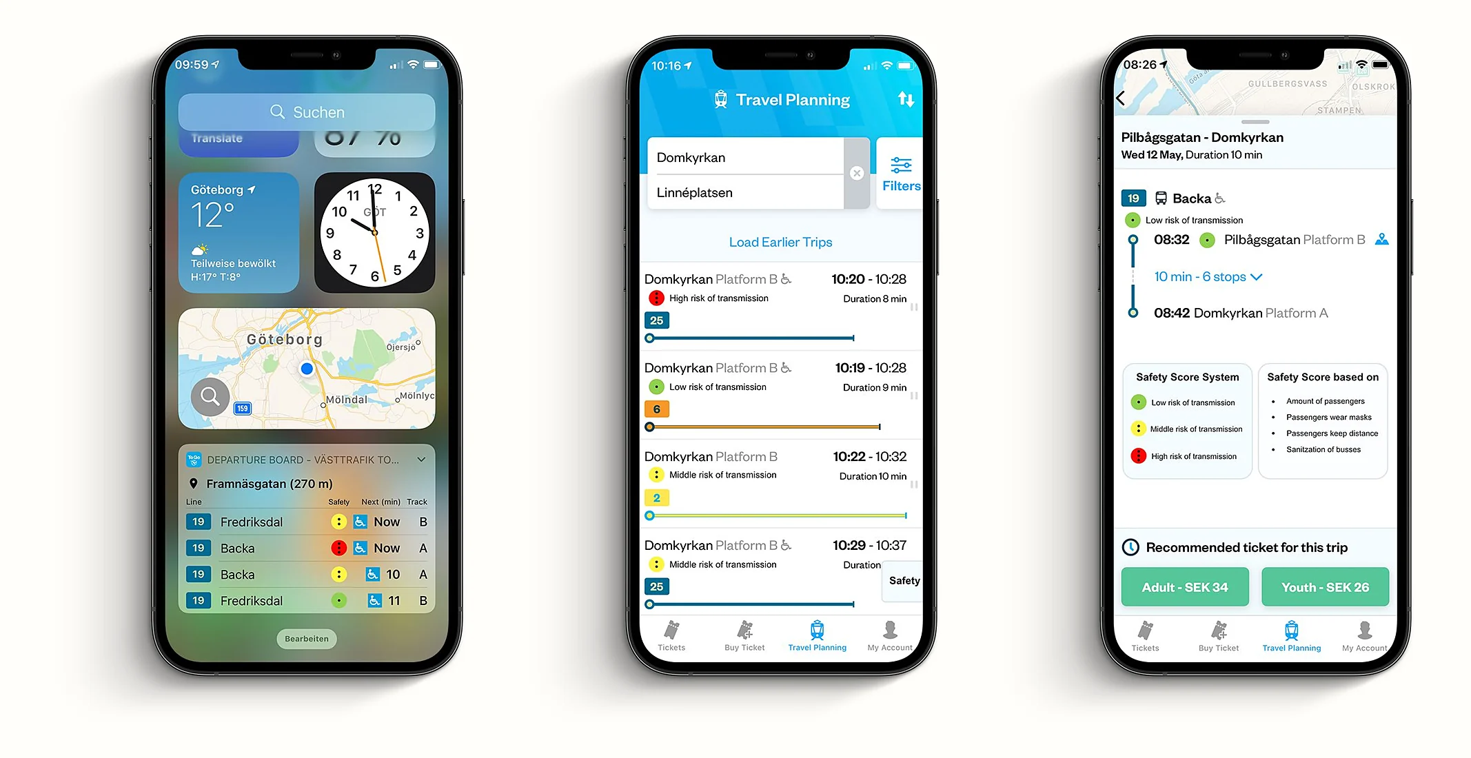
Timetable screens show a live dot next to every departure. Posters explain the system to people the app won’t reach, and an INFO button reads the information aloud through the existing loudspeakers.
Touchpoint / 02
In the app
Västtrafik To Go gets a dot column in the stop widget and on every travel-planning result. A legend on the trip screen explains each level and what the score is based on.
Touchpoint / 03
On the vehicle
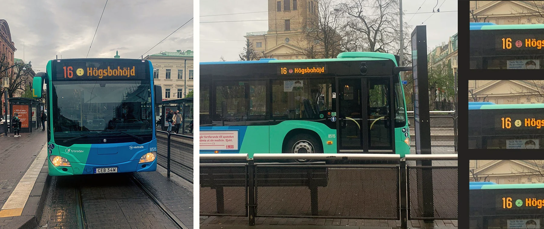
The dot appears without text on the front and side destination signs, so it can be read from any angle as the bus or tram arrives.
07Evaluation
Compare today’s design with the new one.
Five participants took part individually in controlled user testing and evaluation walk-throughs, thinking aloud, followed by semi-structured interviews. They searched for a trip in the existing app, then did the same with the proposed design, and reviewed the posters and screens at the stop and on the bus.
Finding / 01
Clearer and more concise.
The team concluded that the Score System visualised safety levels more clearly and concisely than the existing design.
Finding / 02
The dots were understood.
Participants said the green dot made them feel welcome on board and the red one scared them, showing they understood what each level meant.
Finding / 03
Explaining the system built trust.
Information presented from a safety perspective, at critical locations, and explained to passengers, was what the team saw driving the effect.
LimitationsBecause the study ran during the pandemic, every evaluation had few participants. Field studies would be needed to measure real-world impact and test whether the score’s parameters are feasible.
08Team & Role
A team project, with clear roles.
The project was carried out by six students from Chalmers University of Technology and the University of Gothenburg. Everyone worked on the literature review, the analysis of observations, requirements and the evaluation. The rest was split.
Gregory Axton, Bryan A. Azimoh, José Bener, Tim Björk, Birte Grosskopf, Lovisa Sandberg
- ObservationsBryan, Gregory, Tim
- PersonasLovisa, Gregory, Tim
- Focus groupsBirte, Lovisa, Tim, Gregory, José
- PrototypeGregory, Tim, Birte
Next / Contact